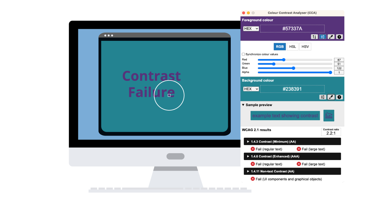
One Color Contrast Tool for All Your WCAG Color Checking Needs

The color contrast checker can be used on websites, during app development, designing social media graphics, PowerPoint slides, PDFs, InDesign files, and almost anything!
CCA Core Features
![]()
Foreground and Background Color Picker
Both the Foreground and Background display include an eye dropper icon that lets the user select a color on a page or screen and display the value of the color in HEX format by default.
![]()
Conform with WCAG – A, AA, AAA
CCA currently displays contrast ratio results according to WCAG 2.0, 2.1, and 2.2.
![]()
Easy Adjustable Sliders
Go from color failure to conformance with the color sliders control. Add RGB, HSV and HSL formats to the display. Easily manipulate the sliders to adjust the color values of both the Foreground and Background to achieve a contrast level that satisfies your target level WCAG Success Criteria.
![]()
Manually Check Your Color Values
Manually type or paste color values in HEX, RGB, HSV and HSL formats.
![]()
Alpha Transparency Support
Alpha transparency values are supported for Foreground colors.
![]()
Switch Foreground and Background Colors Easily
The CCA switch colors control lets the user swap the Foreground and Background colors.
![]()
Copy Your Test Results
Quickly copy your contrast test results in either a short or long format and paste into assessment reports. These formats can be manually edited as preferences in the CCA menu.
![]()
Color Blindness Simulator
Ensure readability for all users by checking your color contrast across eight different vision deficiency settings.
![]()
Sample Preview Display
The CCA sample preview displays both “example text showing contrast” and an icon to display non-text contrast.
![]()
Personalized Preferences & Shortcuts Commands
Preferences can be set in the CCA menu as Options for:
- How many decimal places contrast ratio precision is set to
- Whether the application is automatically updated
- Setting the application language system default or to one of 12 languages
- Shortcut keys to quickly activate the Foreground or the Background color picker
![]()
Theme Display
Set your UI theme display to light, dark, or the system default. Enable Dark Mode to reduce the brightness and ease the eye strain.
Go Beyond Color, Design Inclusive User Experiences
UX
Resources
Create Inclusive UX
Improve your UX accessibility knowledge with our blog series and learn how to connect accessibility with user experience to create inclusive digital products.
Common Web Accessibility Issues
Ten Common Web Accessibility Issues
If you are just starting your digital accessibility journey, start by reviewing some common accessibility issues.
Inclusive
Design Webinar
A Guide to Inclusive Design
Learn about usability, accessibility, inclusive design, and practical tips that everyone can use to make usable and accessible digital experiences.
Usability
Testing
AT User Flow Testing
Ensure you created a usable experience for assistive technology users with AT User Flow Testing.
Learn more about WCAG Color Contrast
WCAG 2.0 Level AA
This level requires a contrast ratio of at least 4.5:1 for normal text and 3:1 for large text.
WCAG 2.1/2.2 Level AA
This level requires a contrast ratio of at least 3:1 for graphics and user interface components.
WCAG Level AAA
This level requires a contrast ratio of at least 7:1 for normal text and 4.5:1 for large text.
Additional Colour Contrast Analyser Information
Support and Development
Have a question about the Colour Contrast Analyser or discovered a bug?
Visit TPGi’s CCA repository on GitHub
End User License Agreement (EULA)
Previous Versions
The current version of the Colour Contrast Analyser (CCA) has been rebuilt from the ground up using Electron. For the previous, non-Electron versions (“CCA Classic”), see the CCA-Win and CCA-OSX repositories.
This program is distributed in the hope that it will be useful, but WITHOUT ANY WARRANTY; without even the implied warranty of MERCHANTABILITY or FITNESS FOR A PARTICULAR PURPOSE. See the GNU General Public License for more details.
